Tuesday, May 4, 2010
Couple of things.
Been a while since I last updated this thing, school has been really hectic the closer we get toward finals. But I feel like I'm handling it pretty well. Anyway, here is the New Yorker Magazine cover I made for the last project we did. I must say I really like how colorful it is. It looks fun. I combined New Year's Day with the Jay Leno and Conan O'Brien Tonight show dilemma that went on earlier this year. I drew everything out first, scanned it, then I worked my magic in Photoshop.SUMMER IS NEAR! Here is the final result:


Thursday, April 15, 2010
ONRA X LITTLE BROTHER VALLEE OF WHATEVER YOU SAY MASHUP.

In case you all didn't know, besides being a Graphic Designer, I'm a newbie producing my own music and I also DJ. I was making some new mashup songs for my DJ sets and I managed to to do a really good mashup of Onra and Little Brother. I mashed up Little Brother's "Whatever You Say" song and Onra's "Vallee of Love" beat. I'm very pleased with this! I'm going to use this in any future DJ set I do. Click on the link to listen to the mashup song I brought together. I put it up for free download as well.
http://limelinx.com/files/286a17364d6abbf2ae4a2554eb4c43b4
Be sure to support the Artists music! Check out Onra and Little Brother at their respective myspace pages below:
http://www.myspace.com/onra
http://www.myspace.com/littlebrother
Monday, April 12, 2010
Some Updates
Wow haven't been on this thing since Spring Break. But I do have some new things to post up! I finished the completed version of my comic strip not too long ago and I've been busy trying to get used to digital painting on my wacom tablet. But here they are!I think I did a pretty decent job.

My completed Mickey Mouse Comic Strip.

Picture we had to digitally paint in class. Looks pretty decent since I have never digitally painted in my life.
We also had to try an imitate a famous artist's style when digitally painting a new set of eyes. I am pleased with how some of them came out. I tried to emulate the following artists: JC Leyendecker, Salvador Dali, Vincent Van Gogh, and Franz Marc.

My Franz Marc eye.

I know I was supposed to make a Rembrandt eye, but I couldn't find any good pics so I did a Vincent Van Gogh eye instead.

Salvador Dali eye.

J.C. Leyendecker eye

My completed Mickey Mouse Comic Strip.

Picture we had to digitally paint in class. Looks pretty decent since I have never digitally painted in my life.
We also had to try an imitate a famous artist's style when digitally painting a new set of eyes. I am pleased with how some of them came out. I tried to emulate the following artists: JC Leyendecker, Salvador Dali, Vincent Van Gogh, and Franz Marc.

My Franz Marc eye.

I know I was supposed to make a Rembrandt eye, but I couldn't find any good pics so I did a Vincent Van Gogh eye instead.

Salvador Dali eye.

J.C. Leyendecker eye
Tuesday, March 16, 2010
PROJECT 2 COMPLETE. Project 3 process and new eyes
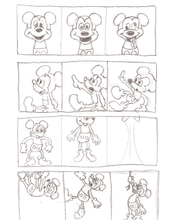
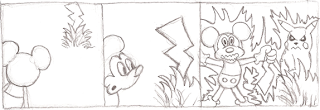
So this weekend has been pretty hectic. I am so looking forward to spring break and summer. Didn't really do anything but homework this whole week. Project 2 kind of took alot out of me but it was well worth it, I honestly believe that I came out victorious with a piece that really represents who I am as a person. It definitley is portfolio worthy. Not to mention it is a very satisfying feeling that it got voted as the favorite in the class. But back on topic. Our digital illustration class was introduced to the SketchUp program that Google provides for free. Its a 3d type of program that lets you create shapes and whatnot in 3 dimensions. When I first used this, I felt like this was like a dumbed down version of Maya. But the purpose of using this program for our 3rd project was to play around with camera placement and see what different kinds of angles we could use for our gag comic. Oh yeah I forgot to mention what project 3 was about huh? Well, we have to draw Mickey Mouse doing something in a 3 panel gag comic strip. It has to have a beginning, a buildup, and an unexpected kind of ending. I will now show the process that I've done so far for this 3rd project that we are working on right now,and more eyes that I did. Oh and my final Project 2 image.
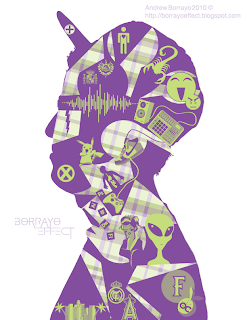
Remember that black silohuette I had a couple posts back? Well here is the final version. One of the best things I've ever done. Alot of people liked the pikachu in there for some reason haha. A fan favorite for sure.
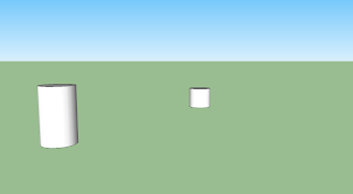
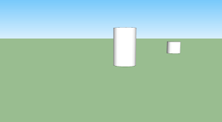
So this was when I was using SketchUp to figure out where I would place Mickey Mouse and another character for my gag comic. Nothing too fancy, but it gets the job done in terms of placement and getting different angles.
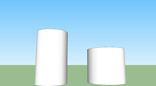
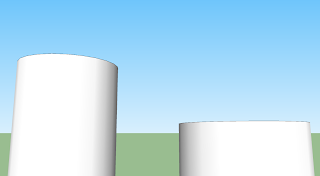
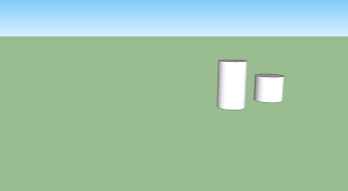
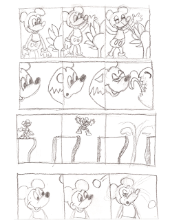
These were the gag strips that I started out with, but I eventually ended up with the one at the very bottom where Mickey Mouse meets Pikachu.
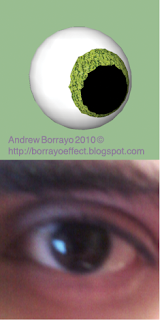
Now here are the eyes that we were supposed to make for this week. One was supposed to be made in SketchUp, and the other was just a close up photo of our eye. I managed to make a sphere in SketchUp so I decided that I would work around that to try and make an eyeball. After using SketchUp, I can conclude that I am not a fan of it.
Until next time my friends.
Remember that black silohuette I had a couple posts back? Well here is the final version. One of the best things I've ever done. Alot of people liked the pikachu in there for some reason haha. A fan favorite for sure.

So this was when I was using SketchUp to figure out where I would place Mickey Mouse and another character for my gag comic. Nothing too fancy, but it gets the job done in terms of placement and getting different angles.


These were the gag strips that I started out with, but I eventually ended up with the one at the very bottom where Mickey Mouse meets Pikachu.


Now here are the eyes that we were supposed to make for this week. One was supposed to be made in SketchUp, and the other was just a close up photo of our eye. I managed to make a sphere in SketchUp so I decided that I would work around that to try and make an eyeball. After using SketchUp, I can conclude that I am not a fan of it.

Until next time my friends.
Wednesday, March 3, 2010
An eye in love and a morning exercize
Hello everyone, hope you all are enjoying your week. I'm going to keep this short today since I have a big Art History test on Thursday night that I MUST study for.(Its my primary focus compared to my other classes this week) But we had to make an eye with an appealing and meaningful pattern (it shouldn't just be nice to look at, but it should communicate something more about the eye). So I made a heart pattern in illustrator and came up with the eye you see below. It looks nice to look at, and it also communicates the message of being in love or infatuation.

This is something we did on Illustrator last Thursday using Kandinsky as an example. We had to make an absract representation of ourselves. It looks ok I guess though it kinda looks random in my opinion.


This is something we did on Illustrator last Thursday using Kandinsky as an example. We had to make an absract representation of ourselves. It looks ok I guess though it kinda looks random in my opinion.

Saturday, February 20, 2010
Project 1 and more eyes.....and my day.
So today was pretty long but pretty cool. Went to LA to go buy some vinyls at Poobah records. Then went on down to little Tokyo and ate some really bomb chicken katsu from Curry House.I also went on down to Anime Jungle and bought a PVC figure of the X-men Character named Psylocke to add to my figure collection. My poor MPD32 is not getting the attention it deserves since I havent had a chance to make any music. But its alright its only because I've been focusing on my classes and stuff. But I WILL be making a new track next weekend....assuming I don't have a mountain of hw to do. But anyway, I have been starting on Project 2 and the eyes we were supposed to do. We were supposed to do 2 different kinds of eyes. But this time around, one of the eyes (according to blackboard)had to be made of ONLY an art stroke that you create yourself in Ilustrator.For the second eye,we had to use the gradient mesh tool to color it, and to try to give its surface the look of a one of these materials: candy, glass, liquid or chrome. I chose to do chrome. Here are the results of both eyes:

In other news, We all turned in project 1 already, and I must say I am very pleased with how everything turned out. I ended up making a european deer crossing type sign but with Donkey from Shrek on top of it. It really does look like you would see a sign like this in the world of Far Far Away. Here was the final product:

Thats all for today. It's 1:11 Am as I type this. I should go get some z's.

In other news, We all turned in project 1 already, and I must say I am very pleased with how everything turned out. I ended up making a european deer crossing type sign but with Donkey from Shrek on top of it. It really does look like you would see a sign like this in the world of Far Far Away. Here was the final product:

Thats all for today. It's 1:11 Am as I type this. I should go get some z's.
Monday, February 15, 2010
Lots of eyes and a silhouette.
So I totally remembered that today our digital illustration class was supposed to make 2 eyes with additive and subtractive elements. I was so caught up in Project 1 and the seven sketches we have to do that I almost forgot about all the other stuff. (Not to mention we also have to start preparing stuff for Project 2 already!) It's almost overwhelming but regardless, I always pull through with a positive attiude and still managed to get my eyes in. I made a cool additive one, with aliens adding a new element to the eye I created. I then started subtracting elements out of my second eye and was very pleased at the egyptian-esque qualities that were coming out. I then made it brown to add to that egyptian aura that this eye was telling me. Here are the results:

I also have to post all the eyes we have been doing in class so far on here so here they are, including the alien eye and egyptian-esque one:

Speaking of preparing stuff for upcoming project 2, We had to make a silhouette of a picture that was taken of us. We also have to post this up here. This silhouette isn't the final product, but it will look A LOT better when it is finalized and finished with cool designs inside of it. Here's stage 1:

I guess that's about it. I finshed all the things I needed to do for Project 1 and this eye/silhouette stuff. Now I have to watch that Lynda.com video and finish 4 more sketches in my sketchbook. Oh yeah, I have to write about 30-40 things about myself huh? Dang this is going to be a long night.

I also have to post all the eyes we have been doing in class so far on here so here they are, including the alien eye and egyptian-esque one:

Speaking of preparing stuff for upcoming project 2, We had to make a silhouette of a picture that was taken of us. We also have to post this up here. This silhouette isn't the final product, but it will look A LOT better when it is finalized and finished with cool designs inside of it. Here's stage 1:

I guess that's about it. I finshed all the things I needed to do for Project 1 and this eye/silhouette stuff. Now I have to watch that Lynda.com video and finish 4 more sketches in my sketchbook. Oh yeah, I have to write about 30-40 things about myself huh? Dang this is going to be a long night.
Thursday, February 11, 2010
Some of my best work
Here are some examples of some of my work. You know, since I'm a Graphic Designer and all.

Made this logo for Brainfeeder artist TOKiMONSTA. Be sure to check out her stuff it's ill!
http://www.myspace.com/tokibeats

Made this artwork for TOKiMONSTA's song single called "The World Is Ours" It feels pretty good seeing this on her myspace when you play the song.

Made this promotional artwork for an online publication called Brute-iful.com. They do reviews of Underground Hip hop artist albums and various other stuff. Check their stuff out at http://www.brute-iful.com

Made this for the CSUF Anime Club. It's supposed to be a parody of the NERV logo in Evangelion. Check out the Anime Club at
http://www.csufanime.org

Fullerton Arboretum logo I made for Graphic Design A. This should probably replace the current one they use right now.
Check them out at http://fullertonarboretum.org/home.php

Made this logo for Brainfeeder artist TOKiMONSTA. Be sure to check out her stuff it's ill!
http://www.myspace.com/tokibeats

Made this artwork for TOKiMONSTA's song single called "The World Is Ours" It feels pretty good seeing this on her myspace when you play the song.

Made this promotional artwork for an online publication called Brute-iful.com. They do reviews of Underground Hip hop artist albums and various other stuff. Check their stuff out at http://www.brute-iful.com

Made this for the CSUF Anime Club. It's supposed to be a parody of the NERV logo in Evangelion. Check out the Anime Club at
http://www.csufanime.org

Fullerton Arboretum logo I made for Graphic Design A. This should probably replace the current one they use right now.
Check them out at http://fullertonarboretum.org/home.php
Saturday, January 30, 2010
Long Day Today.
So today was pretty much a "get all your school supllies day". Went to the bank to withdraw some money then went to school. Got my art history book and my sketchbook that I need for Hill's class. Then went to Best Buy in Fullerton to go get that new Intuos 4 Wacom Tablet that came out. I wanted the medium sized one, but they didn't have it there but they told me that the one located in Orange did. But I took a break and went to my grandmas nieces house and chilled there for a little while. After that was over with and done I finally went to the Best Buy location in Orange and got that medium sized wacom tablet and satisfied my heart's desire. I then got some McDonald's and went home. Once I got home I opened up that badboy out of the box and I must say I am very impressed with the things it comes with and its interface. The new Intuos 4 wacom tablets have a more sleeker design and can accomodate right-handed or left handed people. It comes with the grip pen,a mouse,USB cable, The installation disc, and a pen holder that has a detachable bottom to reveal extra pen nibs. Since I have Windows 7 on my desktop I just plugged in the usb and all the drivers were read from the get go. I've been playing around with this thing for about an hour now. It feels a little wierd at first trying to get used to drawing ont his tablet but after about 5 minutes the designer in me kicked and it was almost second nature. So I tried out the tablet with Photoshop and I came up with this it looks pretty promising:

I look Junofied.
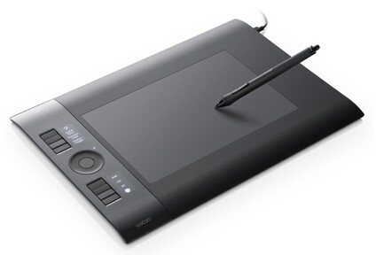
Oh yeah the tablet I bought looks like this.
Until next time, stay thirsty my friends.

I look Junofied.

Oh yeah the tablet I bought looks like this.
Until next time, stay thirsty my friends.
FIRST CONTACT.

Alright, here it goes. School at Cal State Fullerton has just begun and it feels pretty good. I was getting pretty lazy during winter break. But then BAM! all of a sudden I have a blogspot account.This was the result of having digital illustration class with Christian Hill. From what I've seen so far he seems to be a really nice guy who cares about his students, he knows when to have fun and when to work. But back on topic. I've never had a blog before or wrote in a diary for that matter. But I guess things were just meant to happen eventually. But now that I think of it, now is an opportunity to get more of my Graphic Design work and my Digital Illustration work out there with this thing. Hell, I'll even post my music producing sessions. But I guess I have a diary now to document what goes on in the day in the life of myself. Let me tell you a little bit about Mr. Borrayo. Even though I live in Anaheim and consider it my 2nd home, I am originally from LA County. The city of Downey to be exact. Lived there all my life until college.I also like anime alot. By looking at me, you would never think I would. I love experimental hip hop as well, I feel that the process of making music like that is very similar to how a graphic artist thinks up an out-of-the-box kind of concept. I'm in my beginning stages of being an experimental hip-hop producer as well, and if I can be great at Music and Graphic Art at the same time,I'll be a very satisfied man. So befriend me and leave a comment on my work. Tell me how cool it is or what can be fixed to make it look better.I guess I'll leave it at that.
P.S I'm an Angels fan and not a Dodgers fan.
FIRST CONTACT HAS BEEN MADE.
Subscribe to:
Comments (Atom)
